Helloo 🌞
Just wanted to share a more complete version of my entry for the community edition because I had a lot of fun working on it, and I couldn’t say everything on the sub page.
Tell me what you think 🙂
(The project will be (I hope) available soon here among the other participations: See all entries )
This case explores a balance between materiality and innovation. It’s an invitation to slow down, to feel. Through gentle tones and a fresh aesthetic, it highlight the sensory qualities of form and finish, evoking a quiet sense of nostalgia while embracing a contemporary vision of design. An everyday object shaped to connect through technology and touch.

I wanted to create an object that was, above all, pleasing to the eye, but also suitable for all everyday situations. Sure, a neon pink phone would be absolutely stunning, but is it suitable for work?
The first step was to look for pretty tones that were mindful of the environments in which we’d be using the phone.
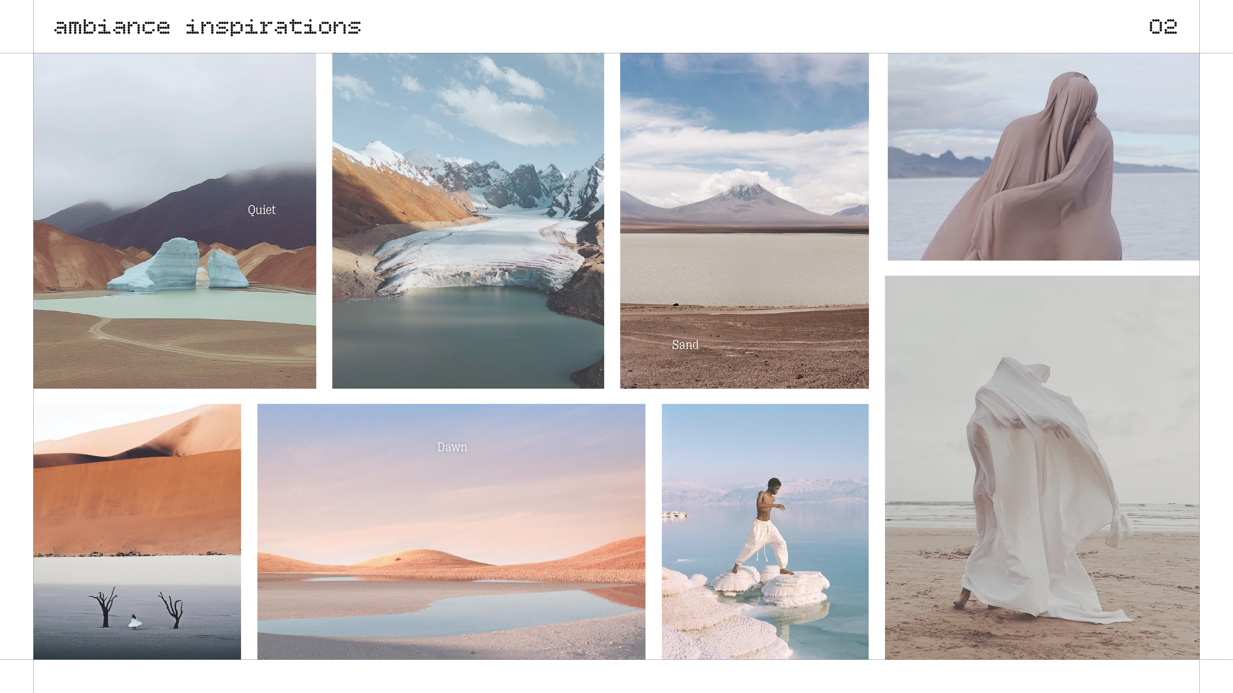
Nature is my primary source of inspiration. I have sought it in the dunes of Namibia, the snow-capped mountains of Altai, the salt flats of Bolivia, and the sandy beaches of Morocco. I wanted a very soft atmosphere, the colors of dawn silently revealing the magnificent colors of the landscapes.

For materials, I looked for slightly textured objects, soft but grainy, like ceramic, velvet, paper…

And finally the main focus of this project: object design from the 70s. Braun colors. Light Ivory 911 Porsche. The off-white of old rotary phones. Memories of a defining era in design, when the trend was for soft, sophisticated, and simple colors.

These 3 moodboards led me to a specific color palette that resume all I wanted to share on a single design.

And here’s how I chose to apply them. The challenge was to combine two main tones: light blue and beige, while maintaining a visual balance and consistency with the use of the phone.
For the blue parts, I imagined a sublte reflective material embedded in the plastic, which would be almost invisible in the shade, but which would reveal its sparkling color once in the sun. So not too much glitter in a “serious” environment where the light is minimal (office, school) but more shine outside, on vacation or on summer weekends.


Now something I haven’t mentioned before, but the phone’s frame also plays a key role. Inspired by recycled materials, it feels like peach skin or ceramic, allowing for a good grip and no fingerprints. The embedded particles evoke the material’s proximity to our fingers, as if we were touching a rock.
For reference, it’s pretty close to the white back of CMF Phone 2 recently announced, I worked on this before the announcement but they actually made the exact material I was trying to find !


Thank you !