Nothing OS has been built upon AOSP since the beginning. On the other hand, Motorola’s My UI was succeeded by Hello UI in 2024, which brought significant changes to various parts of the UI.
While both skins have their own set of design traits and elements, these are built on stock Android and share many similarities.
In this post, I’ll be comparing the UI design of both skins so that you can decide which one you prefer.
Let’s begin 🚀
Left screenshots: Hello UI
Right screenshots: Nothing OS
- About device page
Both Hello UI and Nothing OS feature large banners on top, with the phone’s key specifications towards the bottom.

- Settings app
Here, Hello UI mostly follows the AOSP design language while Nothing OS has tweaked it slightly by removing the sub-text in each section.

- Software update screen
Hello UI not only lists very few changelogs. but also falls short on giving this page a visual identity. Nothing OS makes things interesting by using emojis.

- Launcher menu
Nothing OS follows the traditional stock Android launcher menu design found on Pixels, Moto’s Hello UI takes a different approach by nicely aligning the tabs at the bottom.

- Customisation page
Hello UI allows changing homescreen app icons, choosing any colour theme through an RGB colour selector, using many fonts and more.
Nothing OS offers monochrome app icons, colour theming, and lockscreen glass/ atmospheric effects, that’s all.

- Opened folder design
Hello UI heavily relies on blur here, while Nothing OS folder colour changes based on the device’s colour theme.
Nothing OS also lets users choose 5 different folder designs, which isn’t the case on Hello UI.

- Widget selection page
Once again, Hello UI utilises blur for this menu while Nothing OS has a static colour. Both pages look nice and modern, though.

- App drawer
The background on Hello UI’s app drawer remains white or dark (depending on the theme), while the app drawer on Nothing OS changes based on the colour theme.
You also get a Smart app drawer on the latter which categorises similar apps into big folders.

- Notification panel
Hello UI offers two types of notification panels, the classic and a split panel, like iOS. It uses blur here too.
Nothing OS has a distinctive notification panel in which you can resize the toggles in 1×2 or even 2×2 sizes.
The colours on both panels are changeable based on device’s theme.

- Recent apps page
While both offer a screenshot button in recents page, Hello UI has a dedicated ‘Clear all’ button right at the bottom.
On Nothing OS, you can hold the app and swipe up to clear all apps all scroll all the way to the left to access the ‘Clear all’ button.

- Menu buttons in recent apps page
The menu looks almost the same on both!

- Volume sliders
This is one aspect where both deviate from stock Android. The volume sliders on Hello UI feature blur while on Nothing OS, you get dotted lines within the sliders which is in line with Nothing’s brand identity.

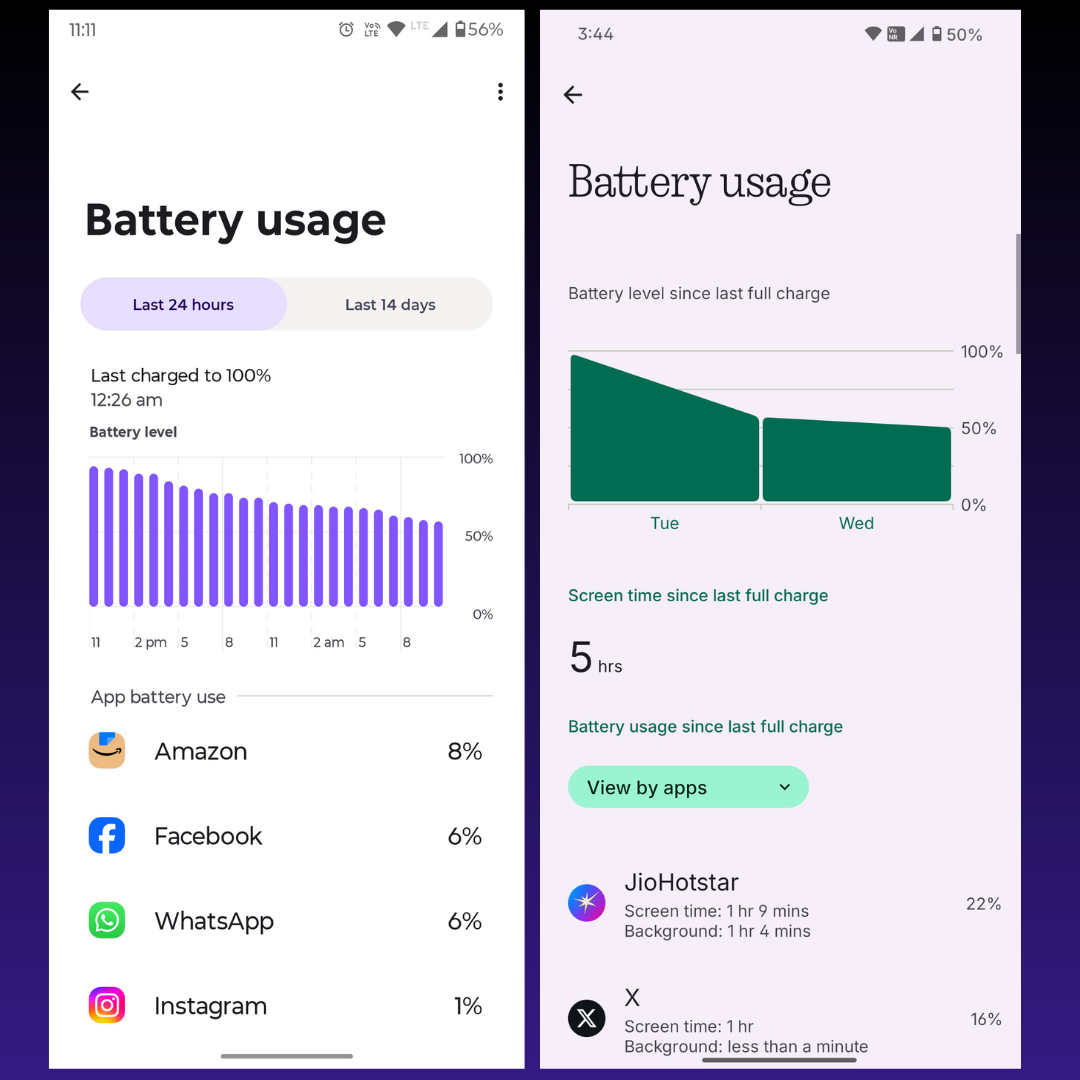
- Battery usage page
On Android 15, Moto’s Hello UI has removed the ‘Screen on time’ stat. Fortunately, Nothing OS 3 continues to carry that.
The battery graph on Hello UI is different from what’s found on stock Android.

- Camera interface
Hello UI’s camera interface colour can be changed based on device’s colour theme, while Nothing OS sticks to a self-made classic-looking UI in the camera app which features thin fonts and red aesthetics.

- Camera settings page

- Status bar icons
The status bar icons for WiFi, data signal, Bluetooth. battery, and some others is exactly the same on Hello UI and Nothing.

- Floating windows

- Quick toggles expanded design
Similar toggle buttons and settings icons on both, with a few UI differences on quick toggles like Bluetooth and WiFi.

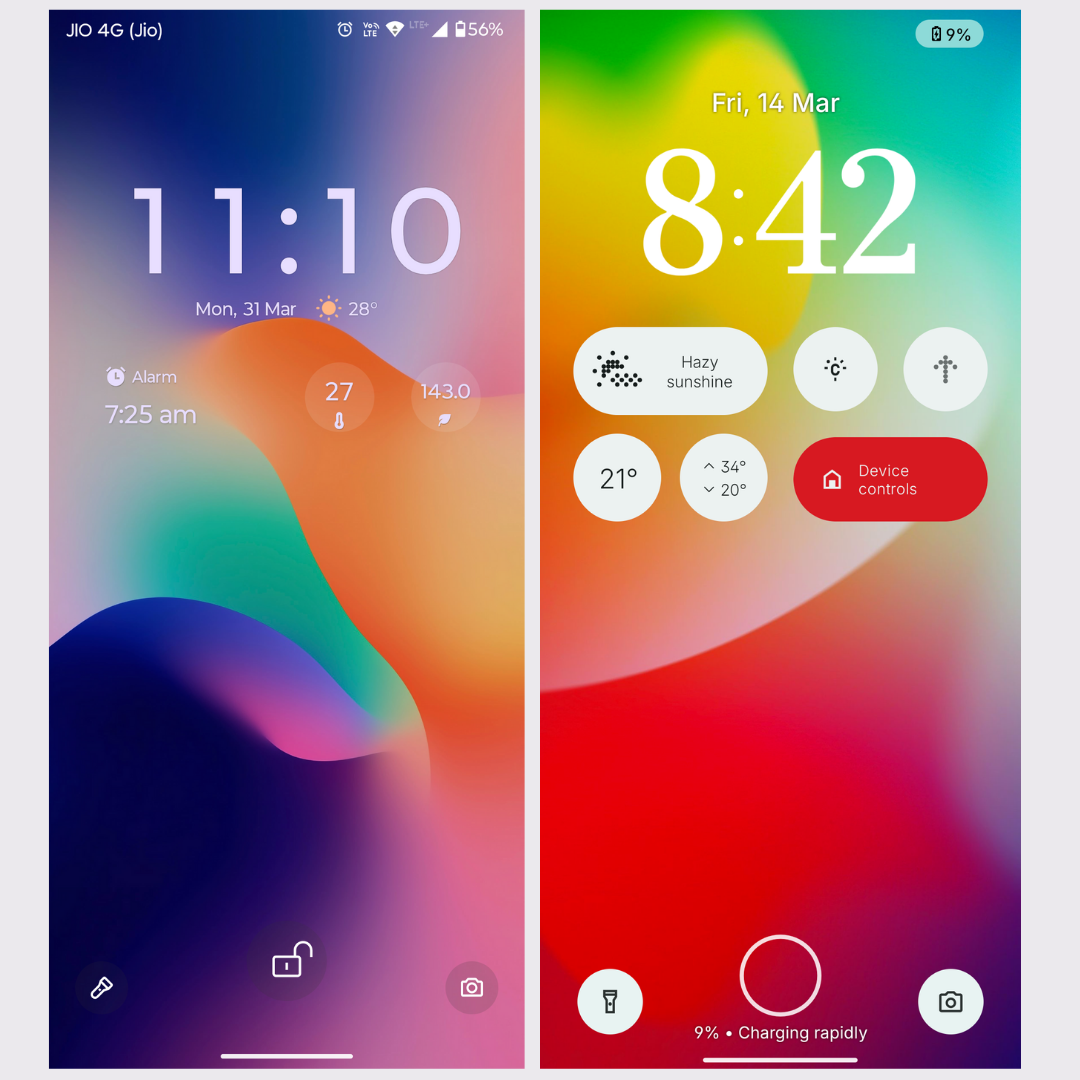
- Lockscreen design
On lockscreen, Hello UI allows you to place just static widgets such as alarm, weather, AQI status, etc. It also has 3 to 4 lockscreen clock styles which you can apply colour to.
Nothing OS features first-party widgets which you can interact with on the lockscreen. It also features several clock styles, but users can’t apply colours to them.
Both skins lack the wallpaper depth effect.

- Lockscreen design (with media player)
The Media player’s seekbar on Hello UI has a squiggly design while Nothing OS features a flat seekbar. The media player as a whole is exactly the same on both.

➡ Few things to note:
- Nothing OS doesn’t have a sidebar which Hello UI does.
- Didn’t compare the first party apps because both skins mostly use Google apps such as dialer, messages, calendar, calculator, etc.
- Nothing OS does have a Gallery app while Hello UI comes with Google Photos as the default gallery app.
Which skin do you find more appealing? Let me know in the comments. 👇