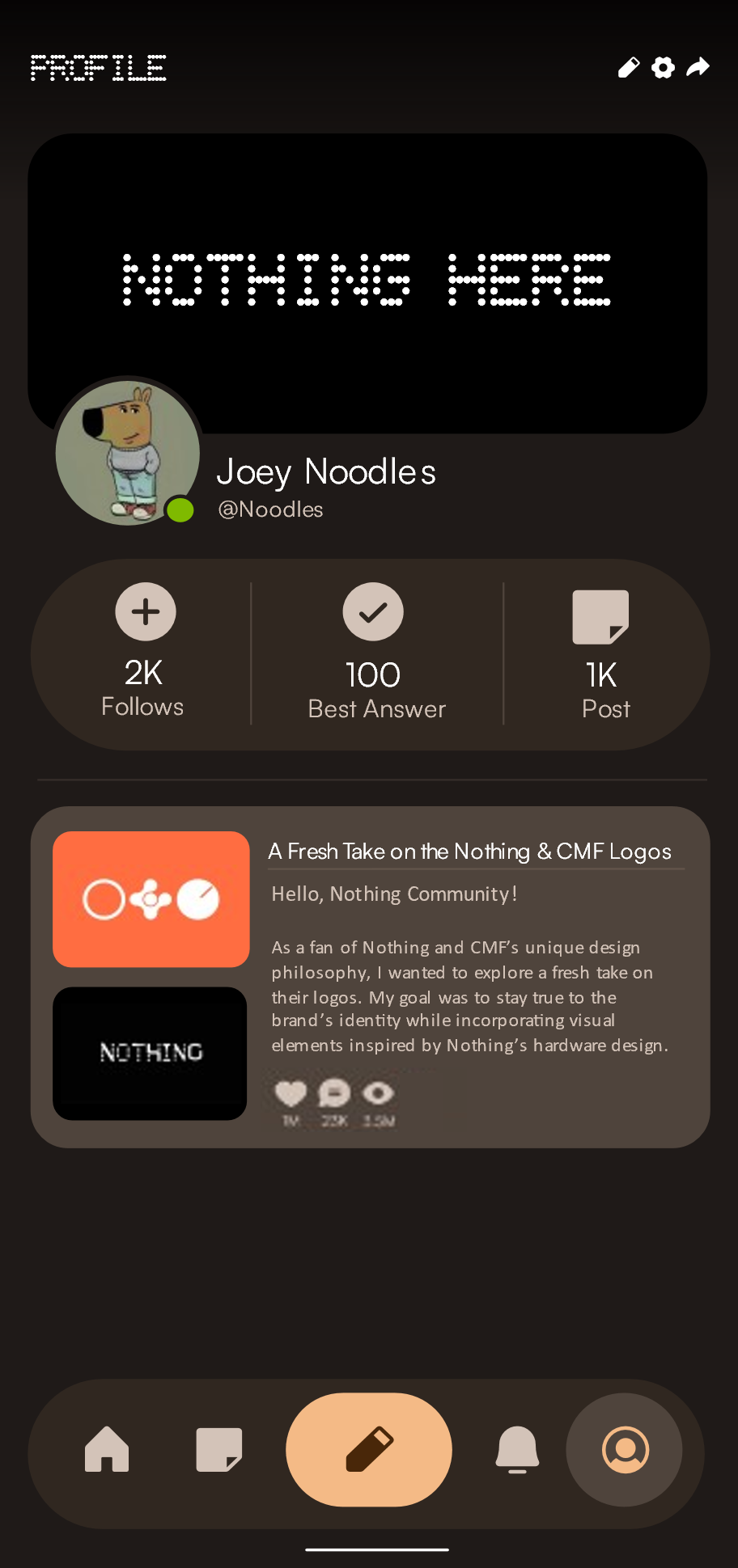
Hello, Nothing Community! 👋
I’ve crafted a brand-new design for the Nothing Community app — one that reflects the essence of Nothing through a clean, flat, and elegant experience.
This concept takes inspiration from the Nothing Photos app and also draws from Android’s Material You design language — but without any transparency or overly decorative elements. Everything here is flat, functional, and intentional. It’s simple, but never boring.
I genuinely hope this becomes the official design philosophy of Nothing OS, much like how Material You defines Android today.
—
🔘 Navigation Bar
I’ve put a lot of thought and effort into the navigation bar. It’s floating, giving it a light, modern feel that doesn’t get in the way of the content. It’s not just a utility — it’s part of the experience. Every icon is intentional, and the layout makes interactions more fluid and delightful.

—
🏠 Home
The welcome space of the app. Clean, uncluttered, and focused on the content that matters most — right where you expect it.

—
📝 Posts
Where conversations come alive. This screen is all about focus — a clear structure that lets you read and engage with posts effortlessly.

—
🔔 Notifications
Minimal and direct. Only what you need, nothing more. Typography is crisp, and layout keeps things tidy and readable.

—
👤 Profile
A personal space that truly feels yours. Your info, posts, and activity are neatly presented in a visually balanced layout.

—
🎨 App Icon
I designed a clean, simple app icon that fits perfectly within the Nothing aesthetic — bold, subtle, and uniquely recognizable on any home screen.

—
🛠 Technical Details
Icons: Phosphor Icons — chosen for their artistic, cohesive look.
Font: Satoshi — for a modern, elegant, and legible reading experience.
—
What do you think? Could this be the beginning of a unified, future-facing design philosophy for Nothing OS?
Would love to hear your thoughts! 💬✨